Optimizations of the asset allocation
In the simulator we could optimize our asset allocation simply by trying different distributions in our portfolio and then looking at the exact withdrawal rates in the corresponding tab. However, the third tab “Optimization of Asset Allocation” now simplifies this process considerably. When we switch to this tab, we first see six “sub-tabs” that allow us to conduct several variations of the set asset allocation:
1. Optimization of the Withdrawalphase with immediate Retirement
Let us start with our classical Trinity example of an immediate retirement:
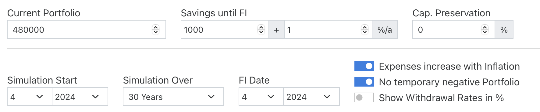
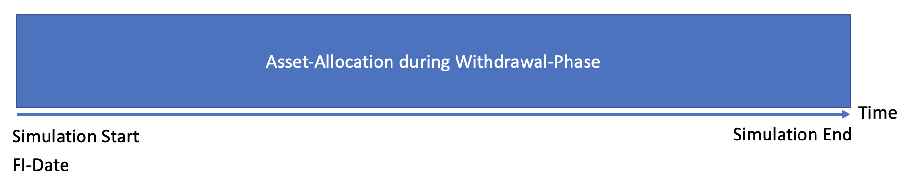
In this start-example of the simulator, the FI date is equal to the simulation start, so there is no actual savings phase. Therefore we jump directly to the (preset) second tab “Withdrawalphase”. In the withdrawalphase we want to keep a constant Asset Allocation (the alternative of a changing asset allocation with a glidepath will be described further below):
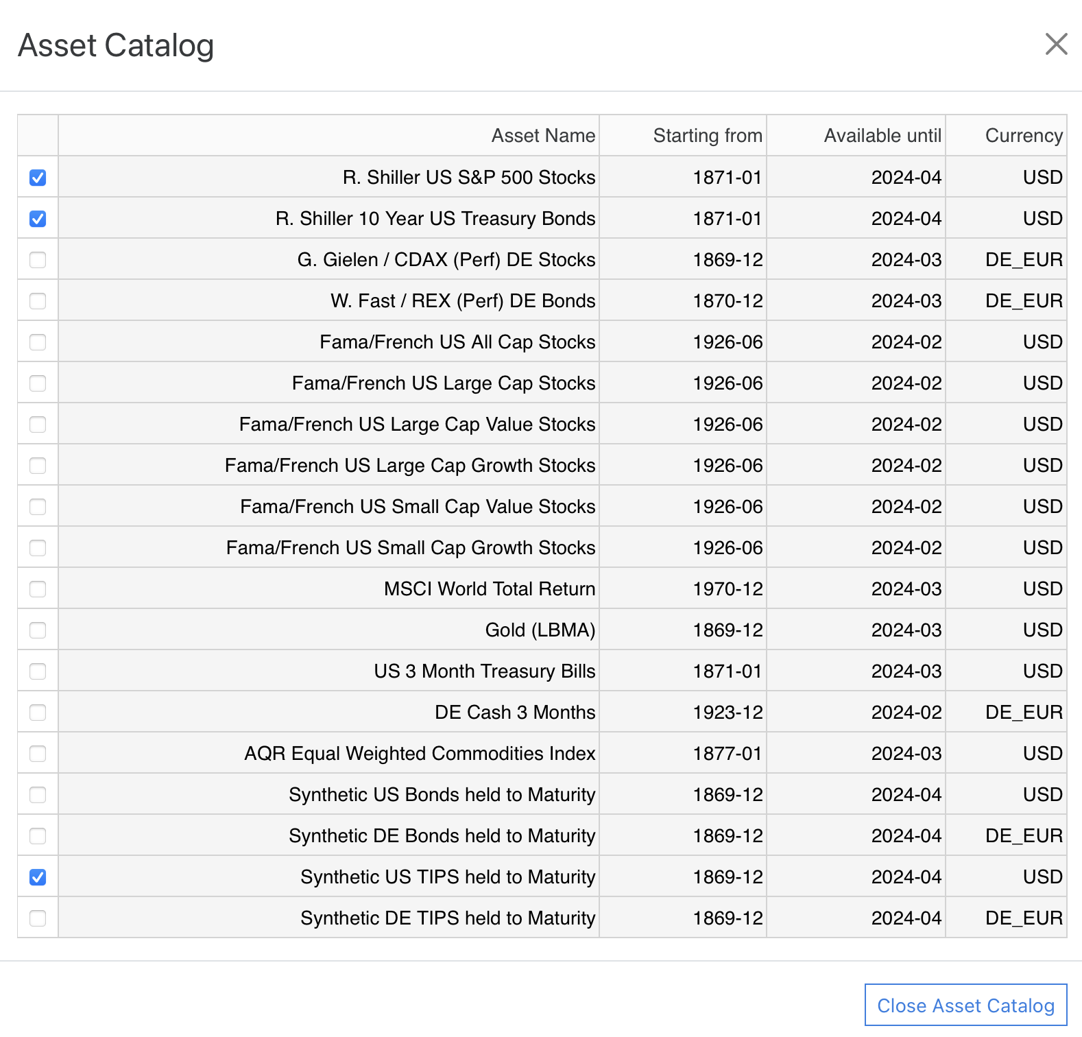
We now want to find the optimal asset allocation between a 100% bond portfolio and a 100% stock portfolio. If both assets are already in our asset selection then we can directly proceed. If not we have to select them first in the asset catalog:
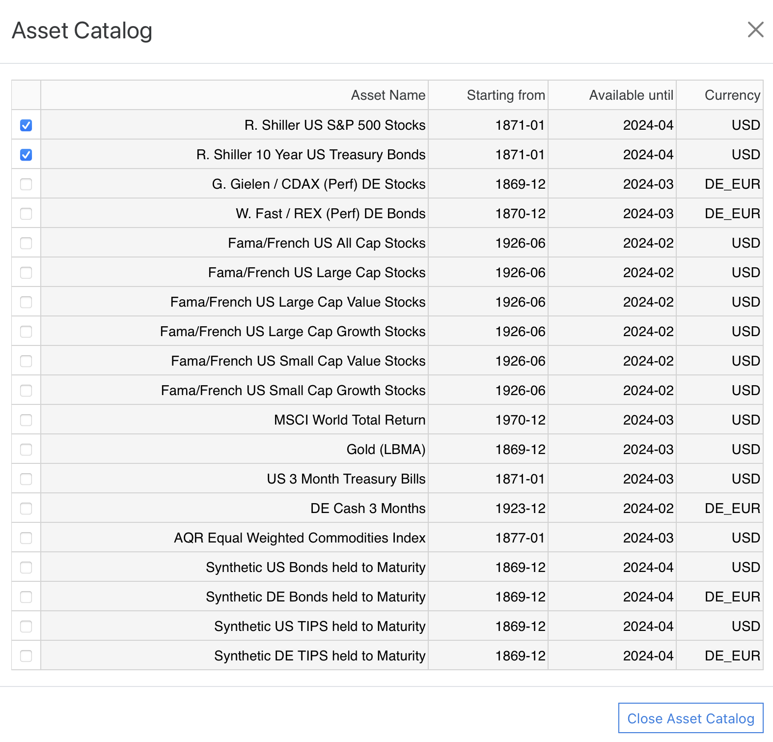
Remark: It is perfectly possible to select more than two assets for analyses in this table. The selection tables in the optimization section just get a little longer and also the markers on the X-Axis of the respective graphs might look a bit crowded. Nevertheless, if you want to analyze more assets in one go, this is exactly what you should do. However the performance of the simulator is best if this selection is as small as possible.
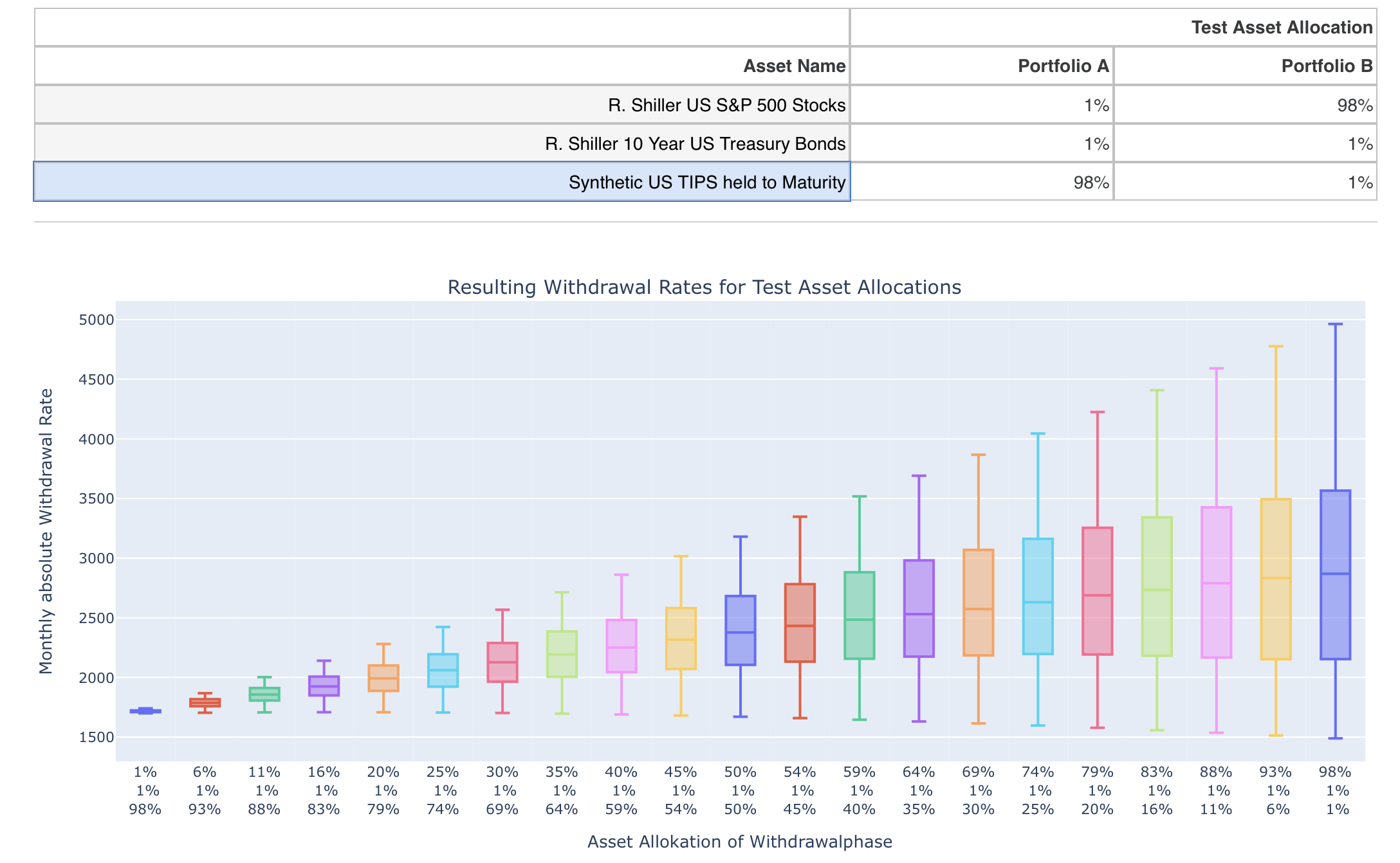
We can now close the Asset Catalog again and scroll back down to the Asset Optimization section. In the respective table below only our selected assets show up and we can now define our two extreme portfolios A and B:
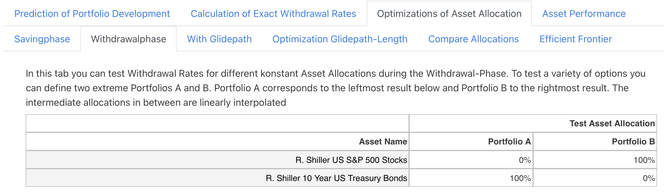
Now 21 portfolios are determined in the simulator, which are linearly interpolated between these two extreme portfolios and for each of these portfolios the possible withdrawal rate for all histories is calculated. All settings and cash flows as well as pensions in the simulator are taken into account when calculating the withdrawal rates. The only exception is the “own” asset allocation, since we deliberately want to investigate variations of this asset allocation here. The result is the following overview:

The left bar corresponds to portfolio A and the right bar to portfolio B. Below, the distribution among the assets is shown in percent so that the portfolio distribution can also be read for all intermediate values.
Let’s now take a closer look at the result. First of all, we can see that the median values move steadily upwards as the share of equities increases. This is of course due to the fact that the expected returns have historically always been higher for equities compared to bonds. The theoretical maximum possible withdrawal rates in the historical best case (marked by the upper limit of the respective bar) also increase steadily with the equity share. Of particular interest to us, however, is the lower limit of the bar, which represents the safe withdrawal rate in the historical worst case. Here, we can see a somewhat different behaviour: The safe withdrawal rate initially also rises with an increasing share of equities, but falls again after 75%. A further increase in the proportion of shares increases the median and maximum values, but the minimum value falls again. This graph therefore represents a central result. A similar picture can be found in Figure 3 in the article by Wade Pfau linked here. The author also shows the safe withdrawal rate (called “SAFEMAX” in the article) as a function of the equity ratio and you can see a similar behavior. However, two differences are immediately noticeable:
- The percentage minimum withdrawal rates are generally slightly higher than ours. The reason for this is on the one hand a different data source (Wade Pfau uses the so-called US SBBI data instead of the stock and bond prices of Robert Shiller). Also, in the standard we always take into account a Total Expense Ratio of 0.22%, which approximates trading costs and tax effects, so our withdrawal rates should be somewhat closer to reality.
- The safe withdrawal rates above 80% don’t drop off as much as they do for us. This is because Wade Pfau calculates with annual returns and with annual rebalancing. In his calculation (which I was able to reproduce) he performs an annual rebalancing in January, which historically leads to somewhat more favorable results than our monthly rebalancing. However, if he had done the rebalancing at other months, the drop would have been even more drastic than ours at high equity ratios. In my view, his presentation is therefore somewhat misleading, because depending on the price development in the future, an annual rebalancing in January could just as well lead to significantly worse results.
In absolute terms, however, the result of adding bonds is quite impressive: instead of $1,200, which would be possible as a withdrawal rate with 100% US equities, the withdrawal rate increases to $1,473 with a 25% bond share. As a result of this simple optimization, one would therefore probably consider an admixture of 25% bonds for one’s own portfolio in case of an immediate start of retirement and would then also add this asset allocation in the tab “Asset Allocation and Stock/Bond/Inflation data Settings”.
2. Optimization of the Savingsphase
As second example we want to conduct a simulation, where our retirement date is in the future and we are still in the savingsphase. The simulator will then allow a separate definition of the asset allocation in the savings- and the withdrawalphase:
According to a rule of thumb, the asset allocation during the savingsphase should be dominated by stocks, whereas at the beginning of retirement an additional share of safer assets like bonds could make sense (as we have already seen in section 1).
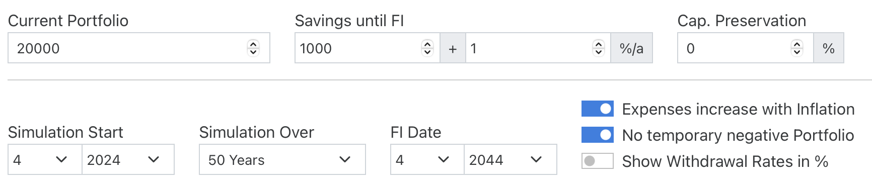
Let’s have a look at a tangible example to test this rule of thumb. We start with the following simulation parameters and now want to simulate a retirement in 20 years time, which should then cover a period of another 30 years:
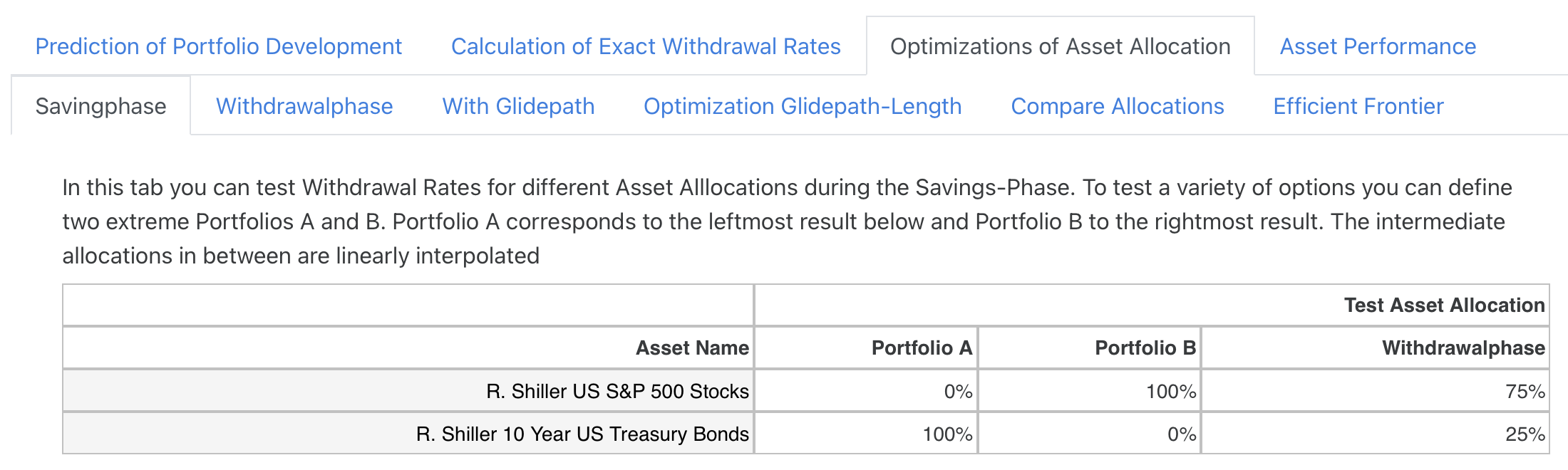
We now want to find out the optimal asset allocation in the savings phase and therefore open the subtab “Savingphase”. Again we want to test all allocations between an 100% US bonds and 100% US equities portfolio while we keep the asset allocation in the withdrawal phase at the apparent optimum distribution we just found in section 1:
The result of our asset allocation variation then looks as follows:
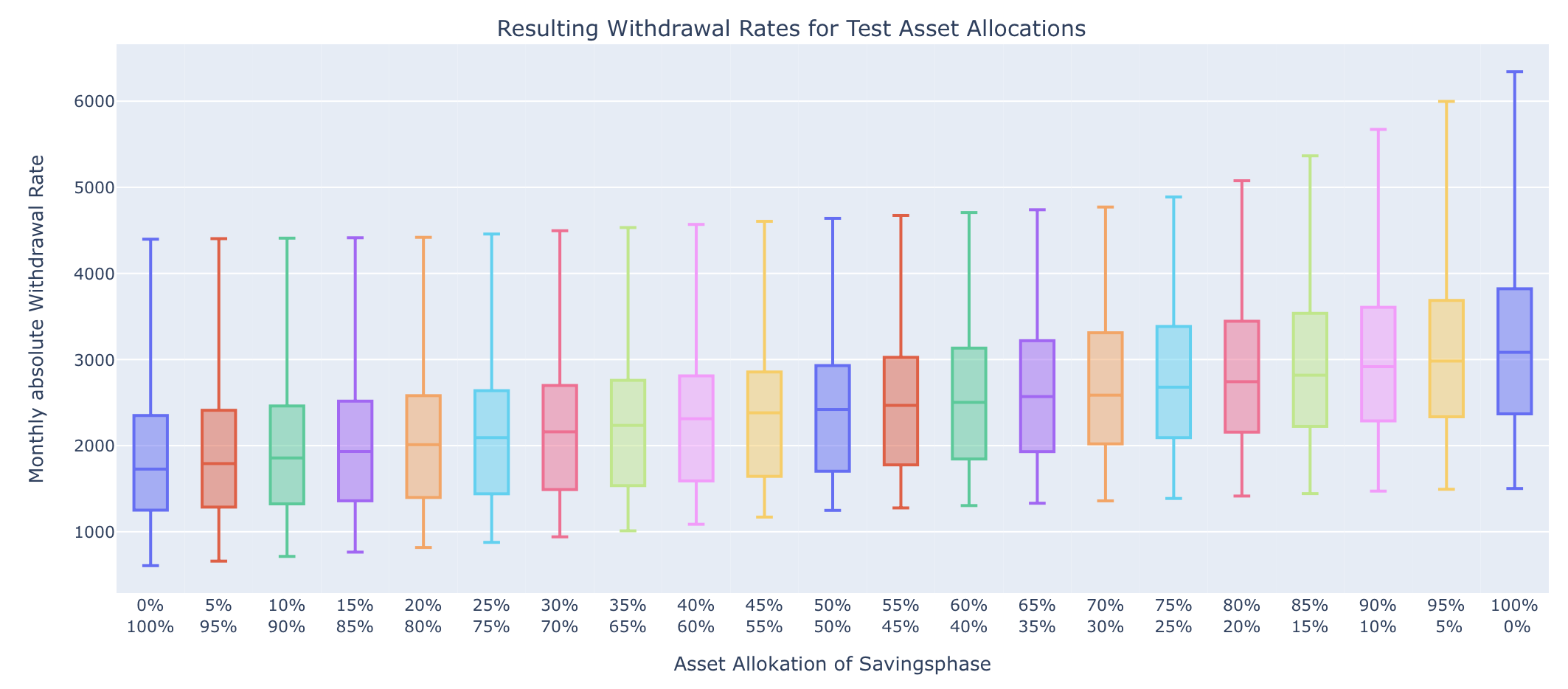
Minimum, median and maximum values of the withdrawal rates happen at 100% stocks confirming the rule of thumb to fully stay in equities during the savingsphase.
3. Optimization of the Withdrawalphase with future Retirement
In the second section we have kept the asset allocation in the withdrawal phase at the optimal mix we have found in section 1. Let’s double check now if this is really the optimum also in the case of a future retirement. To this end we go again into the second subtab “Withdrawalphase” and use the following test asset allocations:

We keep the 100% equity allocation in the savingsphase and want to test all variations between 100% bonds and 100% stocks in the withdrawalphase. The result looks as follows:
In contrast to the above example of immediate retirement, there now seems to be no advantage in adding bonds. Minimum, median and maximum are highest with a share of 100% in the withdrawal phase. Against the background of the first example above, this result seems to be a bit surprising at first, since adding bonds reduces the fluctuation of the portfolio.
I would explain this result as follows: In our example, we cover a 20-year accumulation phase and a 30-year withdrawal phase. Over such long periods of time, both the accumulation and withdrawal phases should contain phases in which stocks and bonds performed very well and very poorly. I therefore assume that due to the known regression of the markets towards their mean, good stock market periods in the accumulation phase balance out with bad stock market periods in the (early) withdrawal phase and vice versa. I.e. those who were lucky in the late accumulation phase due to a bull market to start their retirement with a correspondingly strong portfolio might then historically have been confronted more often with a poor stock market performance in the withdrawal phase. Conversely, those who experienced a crash before retirement and thus started with a smaller portfolio tended to have better stock market performance in the early withdrawal phase. Thanks to the higher expected return of the equity component, this effect apparently makes adding bonds less efficient or even counterproductive in this case.
4. Optimizing the Withdrawalphase using a Glidepath
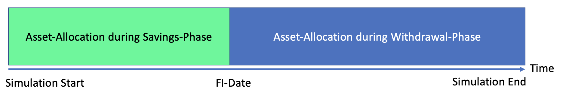
The most complex optimization option defines a so-called glidepath in the critical phase shortly after the beginning of the retirement at the beginning of the withdrawal phase. As we know, especially in this phase, stock market crashes have a serious impact, so we assume that one can possibly realize higher withdrawal rates with a deviating asset allocation. The procedure becomes clear in the following diagram:
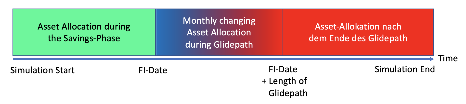
Similar to section 2 above, we first define an asset allocation during the accumulation phase (green). At FI time we then switch to the asset allocation outlined in blue. This is now evolved over the duration of the glidepath to the final asset allocation sketched in red, i.e. it changes monthly during this phase. After that, the final asset allocation drawn in red is used until the end of the simulation period. Typically, for the “blue portfolio” a certain share of bonds or even cash is used (in this case this construction is also called “cash glidepath”) to be less vulnerable to stock market crashes in this phase. The idea is that the lower expected return in this manageable period is less important than the hedge against sharp price drops on the stock market.
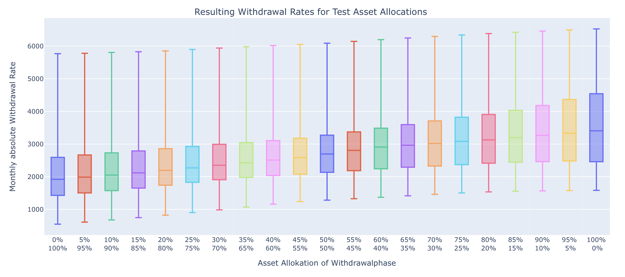
Let’s now take a look at an example to see how well this works. To do this, we’ll again take our starting example from Section 1 of an immediate retirement:
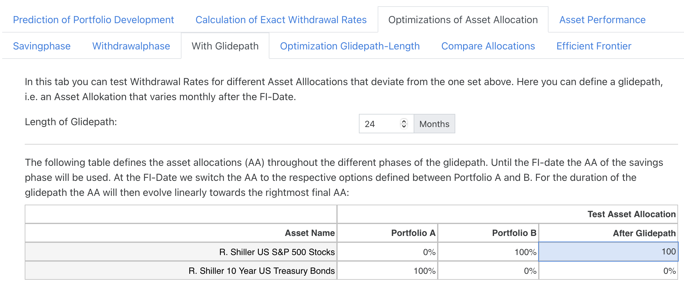
Unlike section 1, however, we now enter the subtab “With Glidepath” and define such a glidepath for a duration of 24 months with the following test asset allocation:
We vary the starting point of the Glidepath (corresponding again to the “blue” portfolio) as usual between Portfolio A (here a pure US bond portfolio) and Portfolio B (a 100% US equity portfolio). We want to have the final asset allocation with 100% equities after the experience from section 2. By the way: The data point of portfolio B here actually corresponds to a constant portfolio with 100% equities, i.e. completely without glidepath. So with this setup, we can simulate glidepaths of different strengths. Since we start with an immediate retirement in this example there is again no savingsphase to worry about. Let’s have a look at the result:
The right bar corresponds, as described above, to a continuous 100% stock portfolio without any glidepath and allows in this constellation as usual a withdrawal of $1,200 per month. If we look at the other data points, however, we see that the Glidepath does have advantages here: A portfolio with a 45% bond share at the FI date, for example, would allow us to withdraw as much as $1,516 per month. This is even a higher value than the $1,472 that a continuous asset allocation of 25% bonds allows. On top of that also the median value of the withdrawal rates is significantly higher compared to the fixed asset allocation with constant 25% bonds. This simply results from the fact that the time period we use an asset component with lower expected returns is shorter. Using a glidepath therefore seems to be a good balance between risk-minimization and return-maximization.
5. Optimization of the Glidepath Length
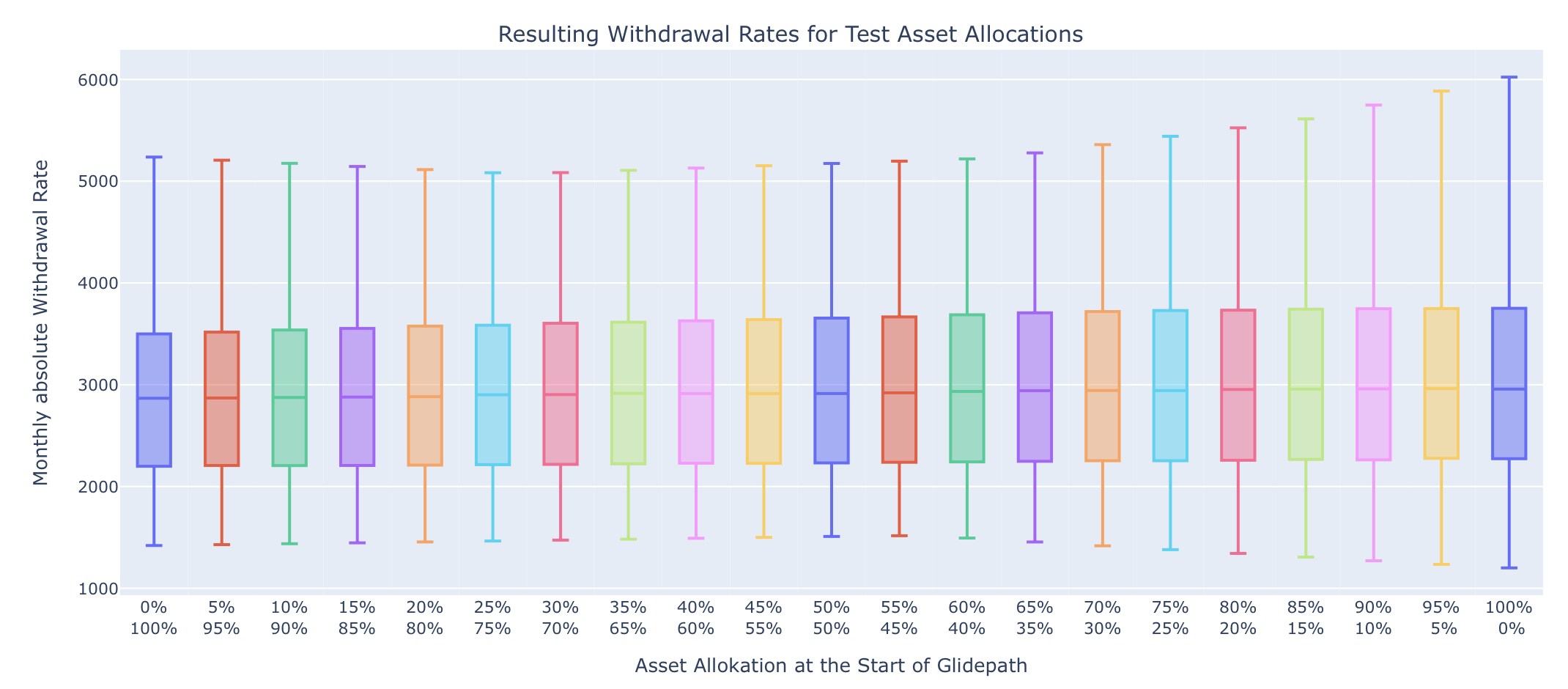
In section 4 we have just used a glidepath length of 24 months without asking where this value comes from. Since version 0.4 of the simulator we can now also investigate the optimal length of such a glidepath using the subtab “Optimization Glidepath Length”. Let’s enter this subtab and use the following asset allocation based on our findings in section 4:
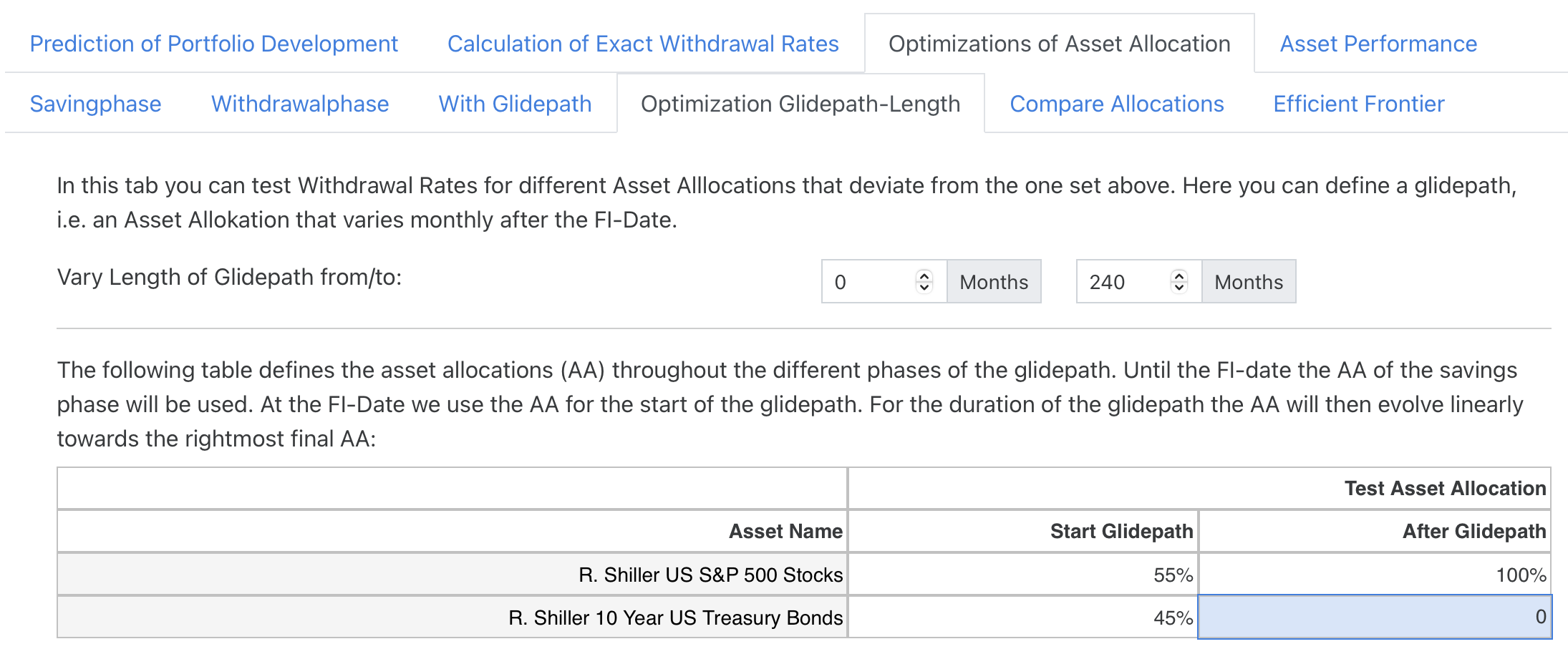
We therefore fix the shape of the glidepath: At the FI date we start with 45% bonds and 55% stocks and change this asset allocation monthly for the duration of the glidepath up to a portfolio with 100% stocks. The length of this glidepath we vary in the following graph between 0 and 240 months. So, the datapoint on the left corresponds to a glidepath duration of 0 months, i.e. our standard case of 100% equities without a glidepath at all.

We see that value of 24 months for the duration of the glidepath does not seem to be such a bad choice. A longer glidepath does not lead to significantly higher withdrawal rates. It is interesting to note that some experts advocate for a much longer duration of such glidepaths between 180-240 months. Using just the Shiller data I cannot support this recommendation so far.
6. Detailed Comparison of Asset Allocations
Since version 0.4 I have added another new feature. The subtab “Compare Allocations” allows for a detailed comparison of results from using our own asset allocation with a separate one. Let us keep our own asset allocation with 100% stocks and enter this subtab using the optimal asset allocation we have found in section 1:
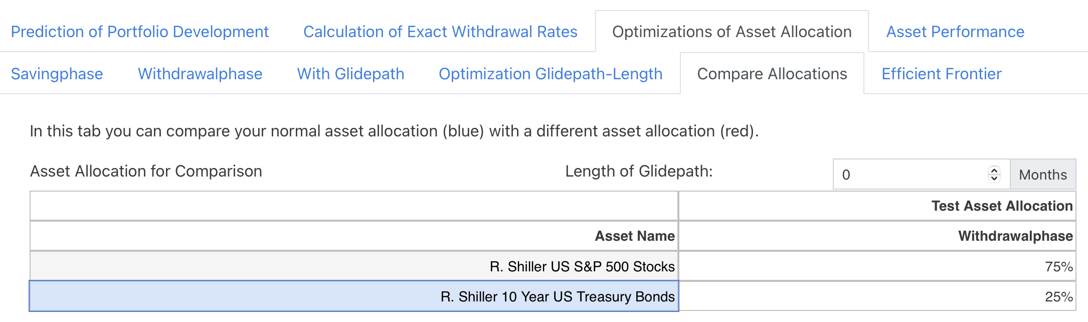
In the following graphs the own portfolio is shown in blue and the comparison portfolio in red. With the simple comparison we did here, we can see the following:
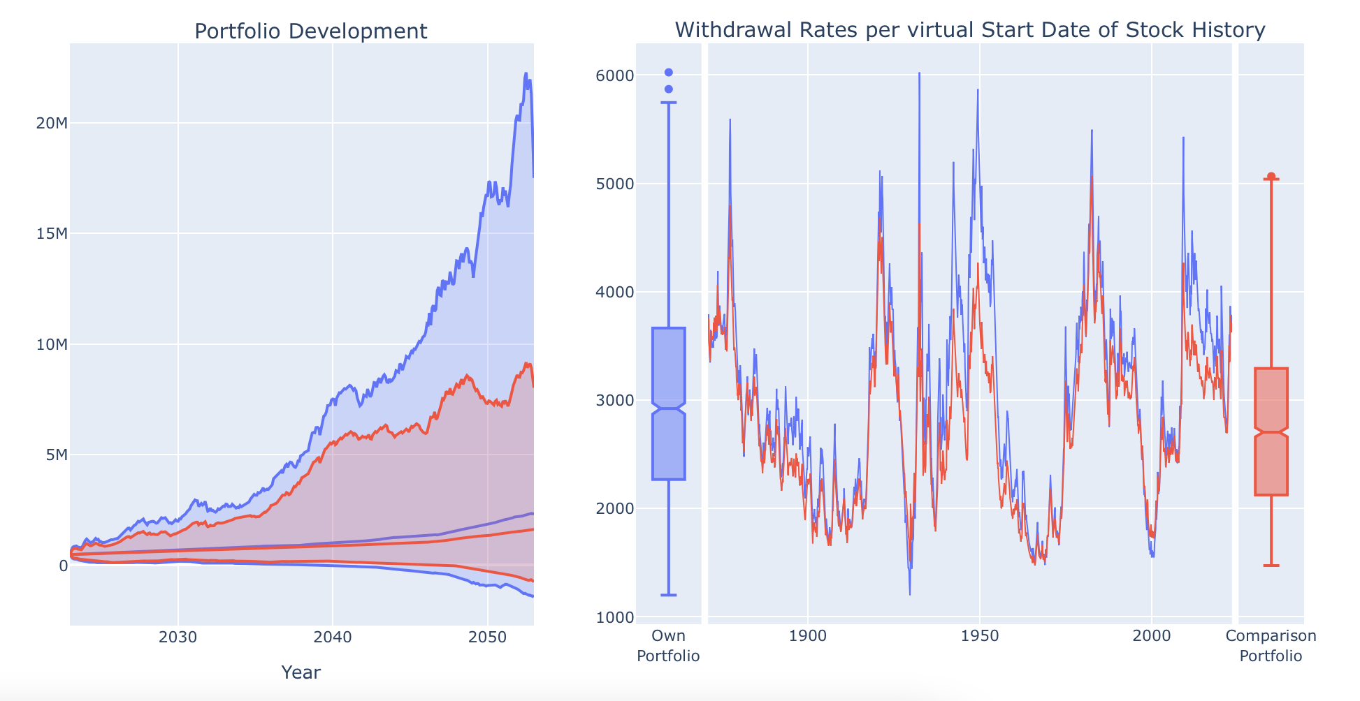
You can see that adding bonds reduces the extreme values our portfolio develops over time considerably. The red funnel is much more narrow than its blue counterpart. Also for the withdrawal rates you can see in detail when bonds help the most. Especially during critial market phases like the Great Depression or after the burst of the Dot.com bubble adding bonds help to reduce the extreme values here. However you can also see that e.g. during the stagflation phase in the early 1970s the values do not change much. Here the red line runs almost in parallel to the blue one.
7. Efficient Frontier
A new function for the overview of asset allocations has been added in version 0.6. The term “efficient frontier” actually comes from portfolio theory and describes a very similar representation in which the average returns of portfolios are shown against their risk for various asset allocations. In such graphs, there is the “efficient frontier”, which represents the possible upper limit of the return for a desired level of risk and this always shows that return always requires risk. In this case the measure of risk is almost always defined as the variance or standard deviation, which explains the name “mean-variance representation”.
However, FI enthusiasts like us should not really be interested in the fluctuations of our portfolio. What is much more important is the safe withdrawal rate I can extract from such a portfolio without going bankrupt prematurely. The minimal or safe withdrawal rate is therefore a much better measure of the risk and we will use that in our implementation. The illustration chosen here therefore provides a quick overview of the ratio of risk (minimum withdrawal rate) to reward (median withdrawal rate) for a large number of different asset allocations.
Let’s take a look at a concrete example. We would like to examine three assets for our portfolio and select them as follows:
Let’s now go to the “Optimization of asset allocation” tab and then to the “Efficient Frontier” sub-tab. At the top, the selected assets are listed with a representative color. After a short pause in the calculation, a random selection of possible asset allocations containing these three assets appears below. So far, however, the screen only contains a relatively small number of data points. This is simply for performance reasons, as several hundred complete simulations have to be calculated for this image and I therefore limit the number of data points to prevent my small cloud server from overloading. But there is a way out: Please set the “Rebalancing Freq.” switch to “Annually” in the “Asset Allocation” tab. With this setting, 12 times as many data points are then calculated and the following diagram should appear:
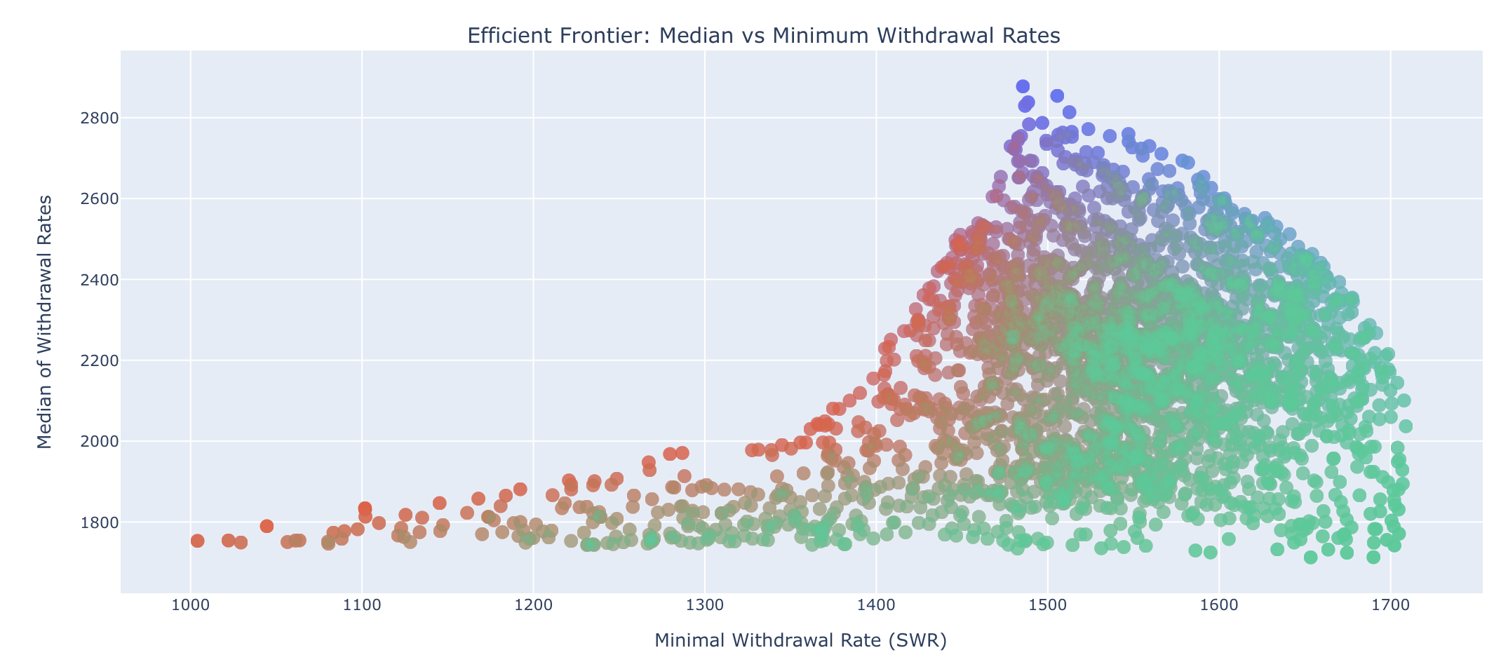
First a note on coloring. The resulting color of each data point corresponds to the overlay of all colors representing the share of the asset in this portfolio. If you move the mouse over one of the green data points at the bottom right, for example, you will see the exact numerical values for the minimum of the withdrawal rates (i.e. the SWR) and for the median of the withdrawal rates as well as the exact asset allocation for this individual portfolio below. We can see here that this data point corresponds to 98% TIPS bonds and contains hardly any other assets (the fact that the proportions shown add up to 101% is merely a rounding effect of the presentation):
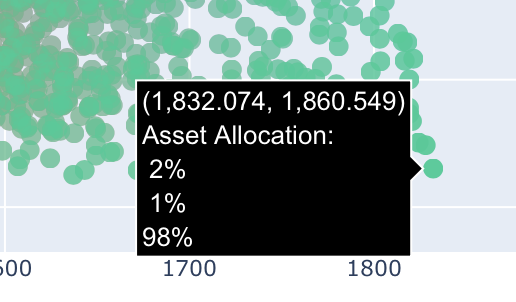
Furthermore, we see that the median is only slightly higher than the minimum. This is simply because we are using synthetic TIPS with a defined real yield of 2.6%, which are not exposed to any price fluctuations as we hold these bonds to maturity. This means that such an asset allocation entails hardly any risk in retirement, although in our Standard Trinity case such a portfolio will be almost completely used up after the 30-year simulation, i.e. potential heirs would then be left out in the cold. Nevertheless, very high withdrawal rates are currently possible with such a portfolio; the SWR of 1830,- in absolute terms corresponds to a percentage withdrawal rate of over 4.6% per year, which is well above the 4% rule and is one reason for the current great interest in TIPS in the USA.
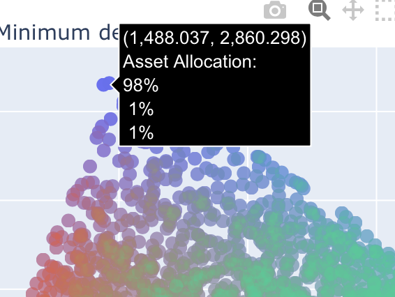
Let us now look at one of the blue data points at the upper edge of the efficient frontier for comparison. This consists of 98% equities and delivers an absolute SWR of just 1,488, which corresponds to 3.7% in percentage terms. However, the value is slightly higher than the normal 3%, which in this case is due to the annual rebalancing:
Let’s compare this representation with the previously known optimization function from section 3 above and use the two asset allocations there. Portfolio A corresponds approximately to the green data point and portfolio B approximately to the blue one:
Although the above values for median and minimum are easier to read here, the display is limited to only two assets, whereas we can “load” our efficient frontier graph with more assets to get a quick overview. The function is therefore very helpful for a rough orientation in the “asset jungle”.
8. Conclusion
This article can only give a rough overview of all optimization functions. Especially using the new assets added since version 0.4 you can easily spend weeks and months fiddling around with the perfect asset allocation. I hope that many of you will enjoy these new functions but would like to conclude with one remark: Many of the effects here are quite small and not always is it easy to see if these effects are real or just remnants of errors in the data series used. And on top of that past performance is no guarantee for future performance, i.e. everybody has to find a meaningful conclusion of these optimization activities for herself or himself. Nevertheless you can easily transfer the end result of your findings into your own portfolio in the tab “Asset Allocation and Stock/Bond/Inflation Data Settings”.
I wish everybody a good time using the new optimization functions!